A butterfly wing, a human figure and a wall of portraits ask different things of a brick. That is what makes brick art worth studying: the material stays familiar while the artistic decisions change.
These six artists offer six ways to look more closely. Some create flat mosaics; others use relief or sculpture. Their work is useful inspiration for a mosaic maker precisely because it shows what color, shape and depth can each contribute.
1. Brian Korte: make the subject separate from its surroundings
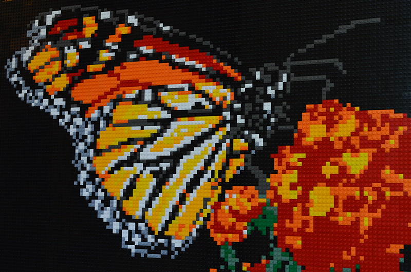
In this butterfly mosaic, black space gives the orange wings a clear boundary. The flowers echo the wing color, but the outline keeps the insect distinct. You can enjoy the pattern of individual pieces close up and still recognize the butterfly from farther away.
In his Lewis Ginter interview, Korte describes planning mosaics digitally before building them. That is a useful reminder that the work begins before the first brick is placed.
Try it: view your reference as a thumbnail. If the subject merges into the background, change the crop or choose a photograph with stronger separation.
2. Ai Weiwei: let the material contribute to the meaning
Trace, commissioned in 2014 for an exhibition on Alcatraz, comprises portraits of 176 people in more than 1.2 million LEGO bricks. The Hirshhorn’s exhibition account connects the pixelated imagery with digital information and surveillance. Here, the repeated grid is part of how the work addresses its subject.
Look for: the relationship between one recognizable face and the much larger field of portraits. For your own design, ask what the subject means before deciding how much detail to preserve. A meaningful image need not be the most technically elaborate one.
3. M’Brick: reward a closer look

M’Brick is Aymeric Gillet, a former Ducs de Dijon hockey player. Dijon’s heritage service documented six city-inspired works in 2023, including subjects drawn from its architecture. The photograph above shows why this practice reaches beyond a uniform field of studs: pieces project from the surface and become part of its texture.
Try it: give your composition two viewing distances. First, make the main shape readable across a room. Then decide which small details deserve attention up close. A flat mosaic can create that second layer through color relationships, even without physical relief.
4. Brian Hanna: treat color as a choice you can revise

Portland-based artist Brian Hanna explains that he selects roughly 20–30 hues from a reference, works outward from a focal point and revisits color choices after stepping back. His process describes a dialogue with the image rather than a single conversion.
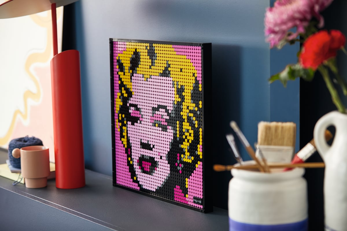
In the portrait above, warm color groups do much of the modeling. The important question is how the tones work together, not whether every original pixel has an exact match.
Try it: after generating a portrait, inspect the eyes, mouth and boundaries between light and shadow. Adjust one area, step back, and compare before making another change.
5. Gerardo Pontierr: explore what happens beyond a flat plane
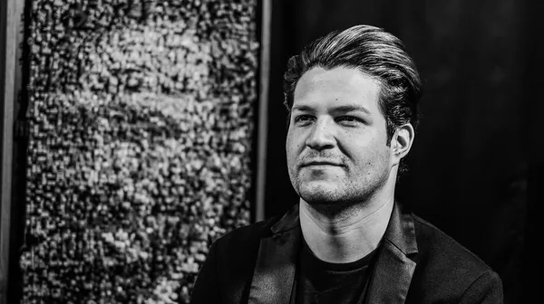
LEGO House’s 2025 Masterpiece Gallery introduces Pontierr as a musician and LEGO artist from Mexico whose practice includes three-dimensional mosaics, including La Catrina. His inclusion offers a useful route into work that brings depth into the picture.
Look for: how a work changes with viewpoint. When planning a flat mosaic, consider its eventual position too. The same design can feel different on a wall seen from a doorway and on a desk inspected at arm’s length.
6. Nathan Sawaya: learn from silhouette, even outside mosaics
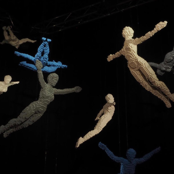
Sawaya’s Division gallery provides a sculptural counterpoint to the mosaics above. The spaces between the bodies and their extended limbs make the gestures readable. It is a lesson in outline and negative space that also applies to a two-dimensional grid.
Try it: temporarily ignore texture and small features in your reference. If the outline carries the pose, you have something strong to build on. If it does not, a different crop may help more than adding colors.
Turn observation into your next design
Choose one principle: a clearer silhouette, fewer competing colors, a stronger focal point or a more deliberate viewing distance. Open an image in Sozaik Studio, make a first version, then revise with that one goal in mind.
In the Sozaik Community, share the design decision alongside the result: “I cropped closer so the eyes would read,” is a more useful conversation starter than simply “What do you think?”
This is an independent editorial selection. Inclusion does not imply that these artists use or endorse Sozaik. Works and photographs remain credited to their respective creators and sources.



0 comments
to join the discussion.