
A brick mosaic has two lives. From across the room, it is a bold message, a face, a flash of color. Up close, it becomes a landscape of studs, edges, highlights, and tiny shadows. The pleasure is in that change of scale: an image you recognize, built from pieces you want to look at.
Sozaik Studio gives you room to shape both experiences. You can compose the picture, choose its palette, work with studded bricks and smooth tiles, refine individual details, and decide how the surface catches the light.
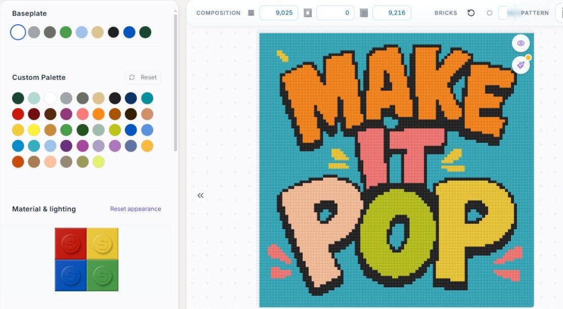
To explore those choices, we created Make It Pop: oversized lettering, electric turquoise, punchy orange, coral pink, and bright yellow on a 96 × 96 canvas. It is playful, loud, and made to catch the eye. Follow it through the Studio, from the overall composition to the character of a single brick.
Give your idea a canvas
A photograph can be a starting point. So can an illustration, a few words, or a composition assembled from images and shapes. The Studio brings these elements into one workspace, where you can move, scale, rotate, and arrange them before generating your mosaic.
That freedom matters when the subject needs a little more space, when a graphic should burst toward the edge of the frame, or when lettering needs to hold its own beside an image. The composition belongs to you.
Choose a baseplate format for a brick project, or explore the formats intended for print and social images. The grid becomes a creative decision: more room for a delicate curve, a tighter crop for a bolder silhouette, or a smaller canvas that asks you to simplify.
Let the palette set the mood
Color gives a mosaic its first impression. A restrained palette can make a graphic feel calm and deliberate. Strong contrasts can give a small design the presence of a poster.
In the Design panel, you can choose a baseplate color and select a custom palette for the mosaic. Image controls also let you adjust brightness, contrast, saturation, and hue while developing the composition.
For Make It Pop, orange and yellow letters jump off a turquoise background, while pink accents keep the composition moving. Dark outlines help the message stay readable. The useful question is not simply how many colors an image contains. It is which relationships deserve to survive when the image becomes bricks.
Make the brick surface part of the design
Anyone who enjoys building with bricks knows how much a surface can change a model. A field of studs has a rhythm of its own. Smooth tiles create a different kind of continuity.
Sozaik lets you set the balance of Basic 1×1 pieces and Tile 1×1 pieces. Our pop composition uses Basic pieces throughout the image area, making the repeated studs part of its character. Other designs may call for a mixture of surfaces.
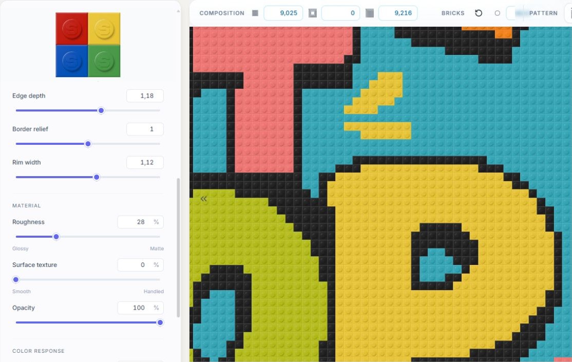
Then there is the finish. The Material controls let you explore roughness, from glossy toward matte, and surface texture, from smooth toward handled. You can also refine edge depth, border relief, and rim width. These choices shape the digital appearance of the bricks, giving the preview its own sense of material.
Direct the light
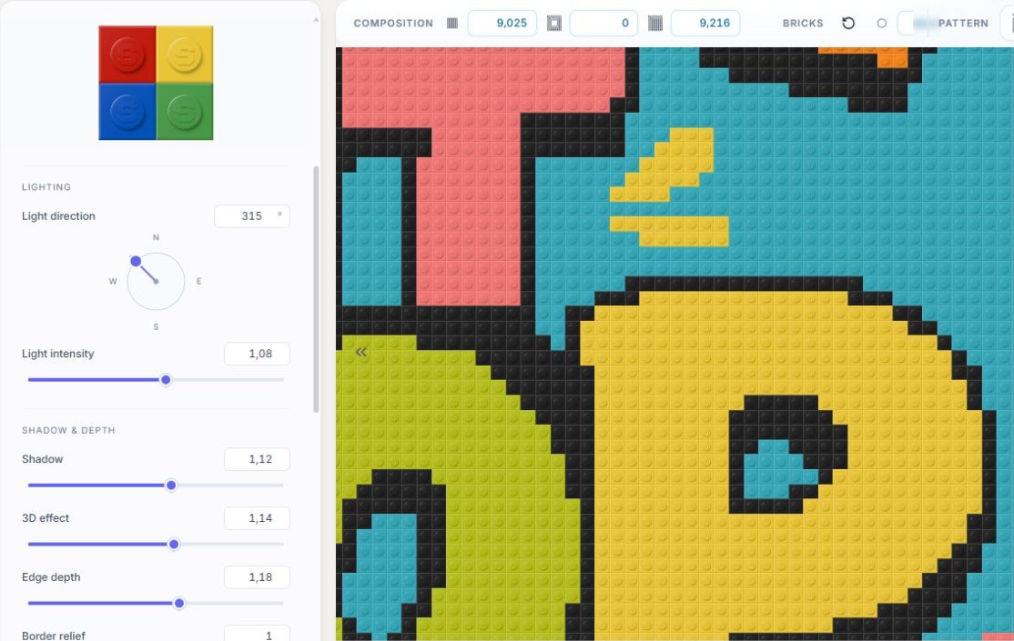
Light is one of the most expressive tools in the Studio. Change its direction and the highlights move around the studs. Adjust its intensity and the surface takes on a different emphasis. Shadow and depth controls let you decide how strongly each piece stands out.
At a distance, these adjustments contribute to the overall mood. Up close, they reveal the small forms that make brick art so satisfying: a raised stud, the line between neighboring pieces, the edge of a tile.
For this pop artwork, a close view makes the effect easy to study. The lettering keeps its punch while the light gives each unit a physical presence. You can explore a quieter finish or a more pronounced relief while keeping the composition in view.
Refine the details that carry the image
The first generated result is a place to begin making decisions. Perhaps a letter needs a cleaner outline. Perhaps one bright cell interrupts a bold block of color. Perhaps a small highlight is exactly what gives a subject its expression.
The mosaic editor provides One by one and Zone modes, a color palette, and an eyedropper. You can work closely on the parts that matter, then pull back to judge their effect on the whole piece.
This is where the idea of a studio becomes tangible. Converting an image gives you a first arrangement of colors. A creative workspace gives you the next move: recompose, recolor, adjust a surface, or make a precise local correction.
Picture the finished piece
A mosaic should work at more than one distance. Zoom in to enjoy the brickwork, then step back until the image reads as a whole. The Studio’s room previews offer another perspective, placing the artwork against different wall finishes so you can explore how it might feel on display.
When you are ready to take the design further, download an image of the artwork or, for a baseplate project, prepare a PDF building guide. A digital presentation and a physical build invite different next steps; the project gives you a place to develop the design before choosing yours.
Try starting with a subject you already love. Give it a clear composition. Explore a palette. Bring the surface into the light. Then make the small changes that turn a recognizable image into a piece with your own character.


0 comments
to join the discussion.